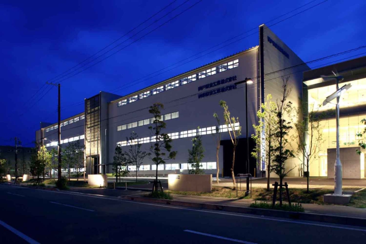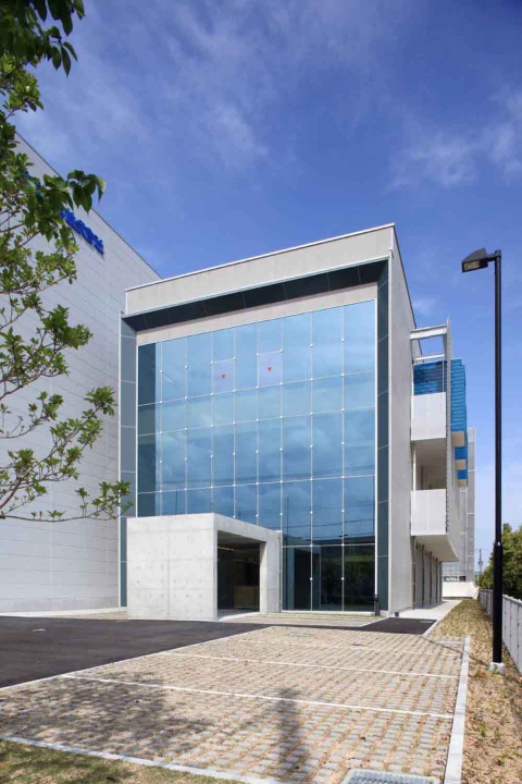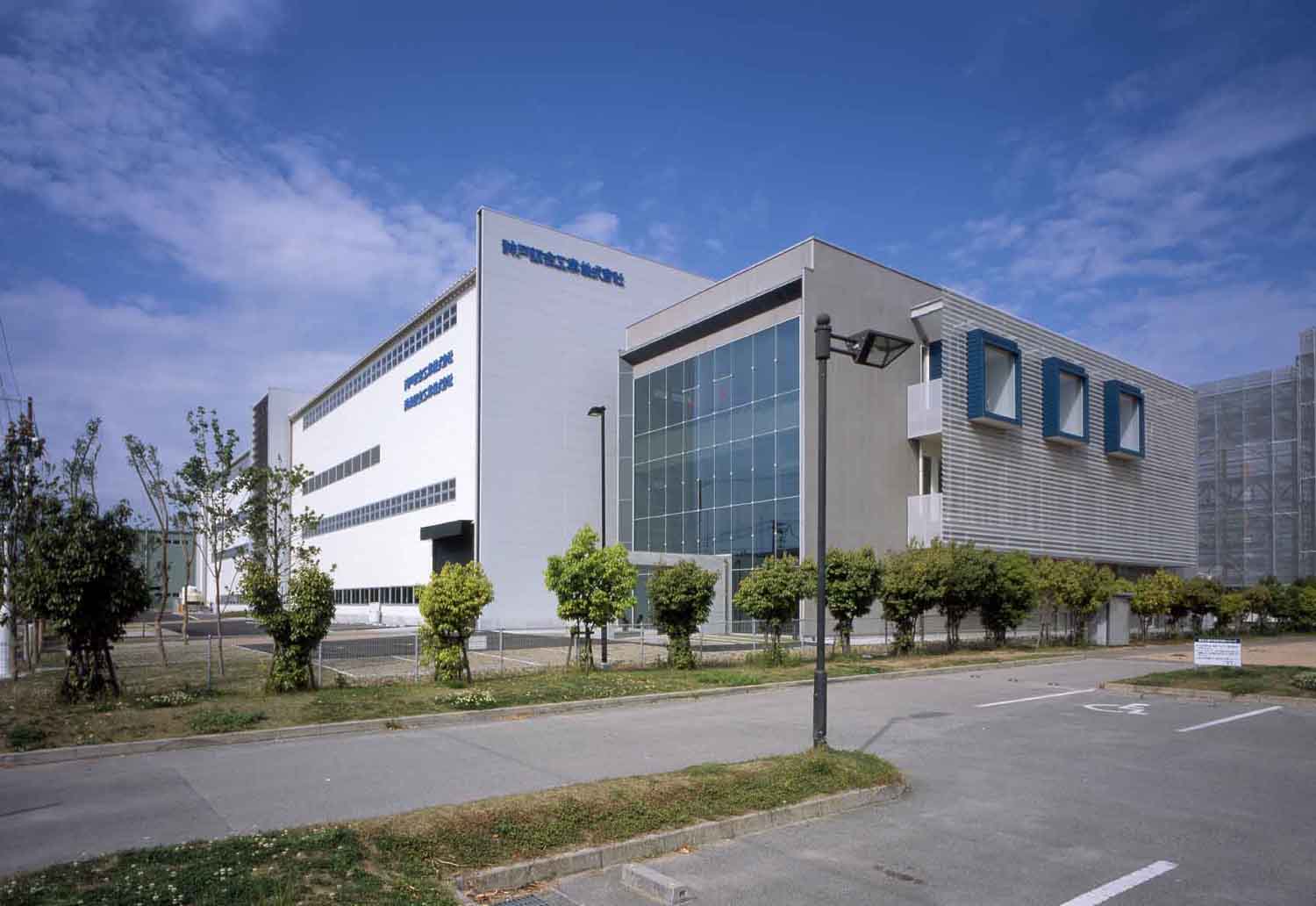
このクライアントは、手狭になった事務所と分散していた工場の集約を目的として、高砂工業団地内に約1haもの土地を購入した。計画で求められたものはまず、企業イメージの向上に繋がる建物のデザインと複雑に交差する生産ラインの明確化(視覚化)、従業員のモチベーションを喚起させるような空間の創出であった。
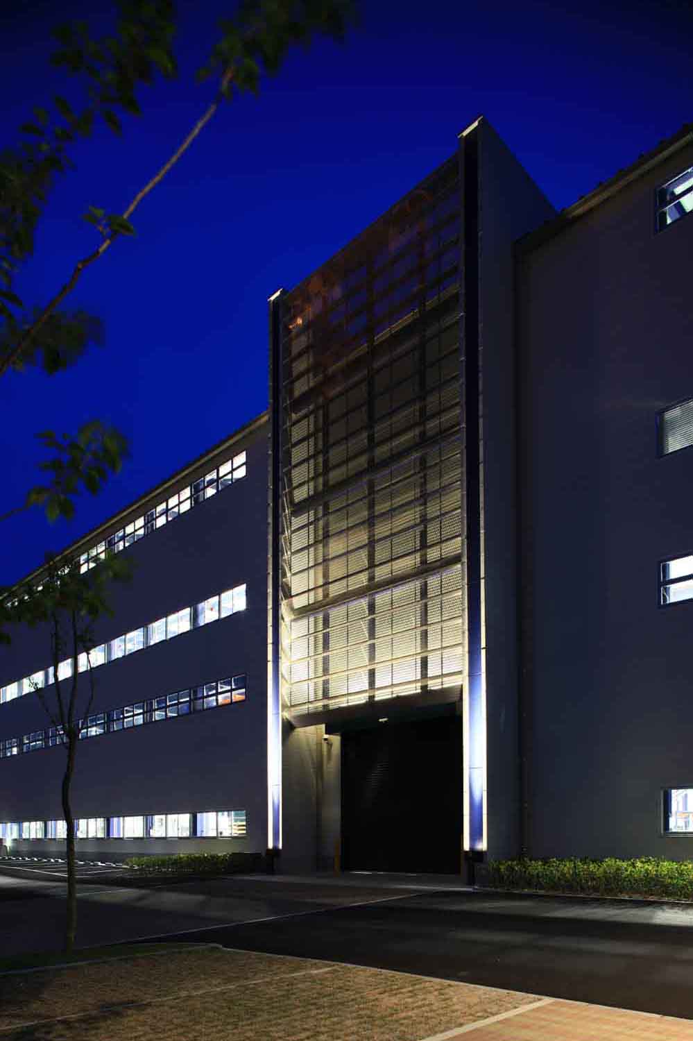
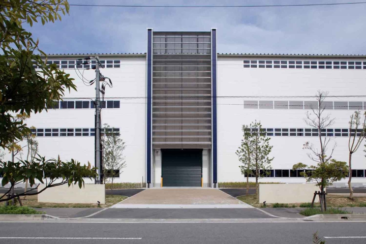
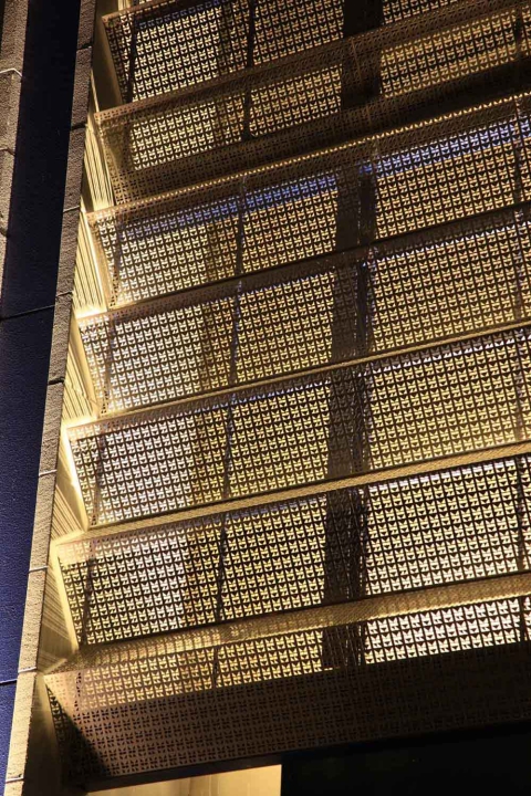
全体の外観デザインでは、企業の経営理念を7枚の大壁に見立て、工場のメインファサードには、折り曲げ加工したステンレスパネルにデフォルメしたロゴをパンチングで加工したものを設置し、自社をアピールしたデザインとしている。
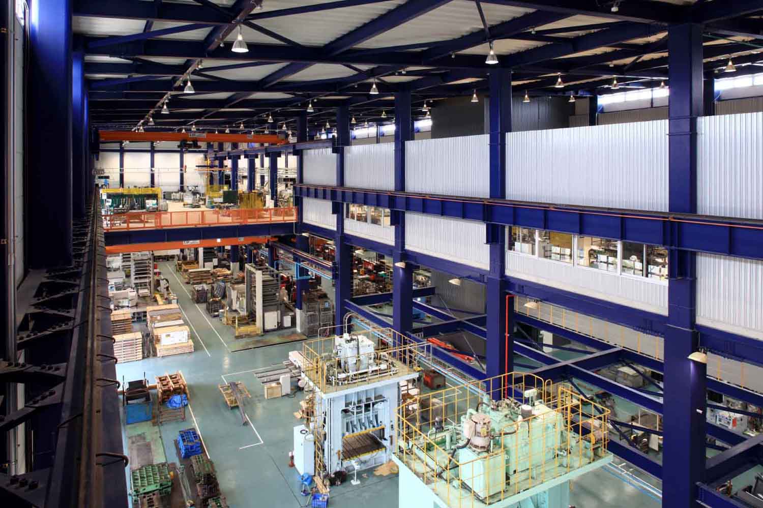
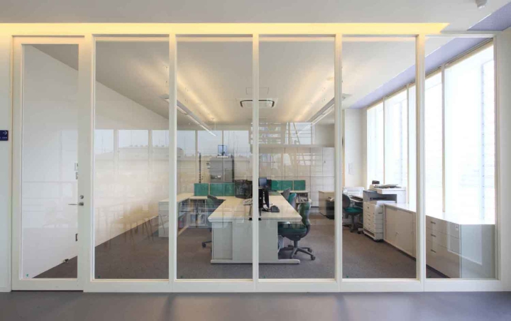
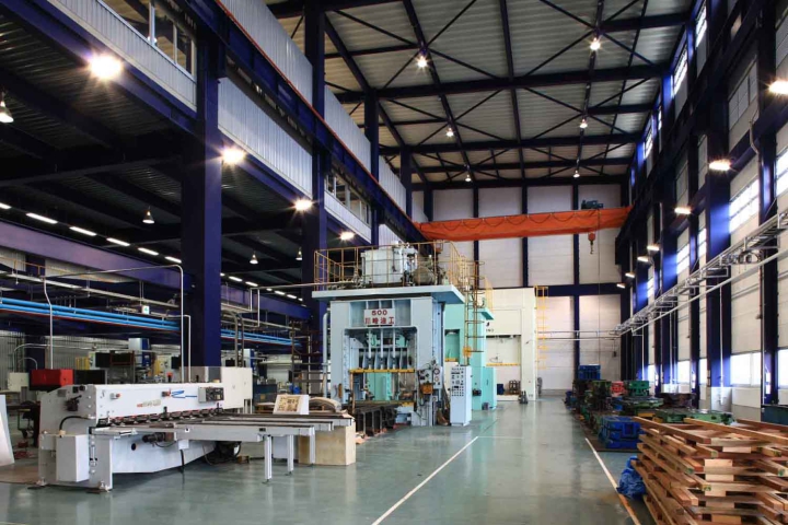
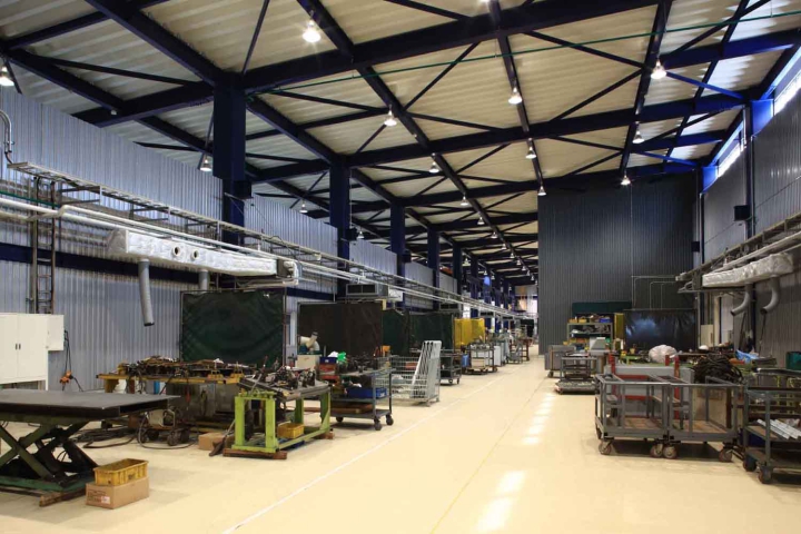
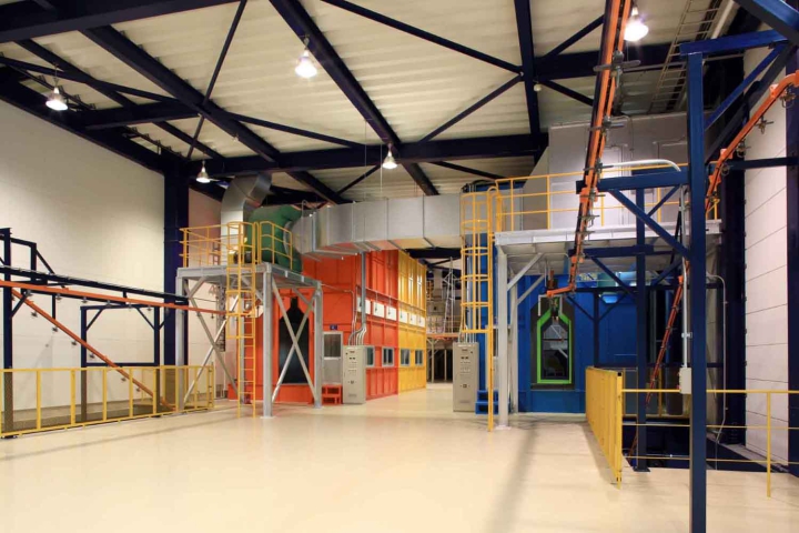
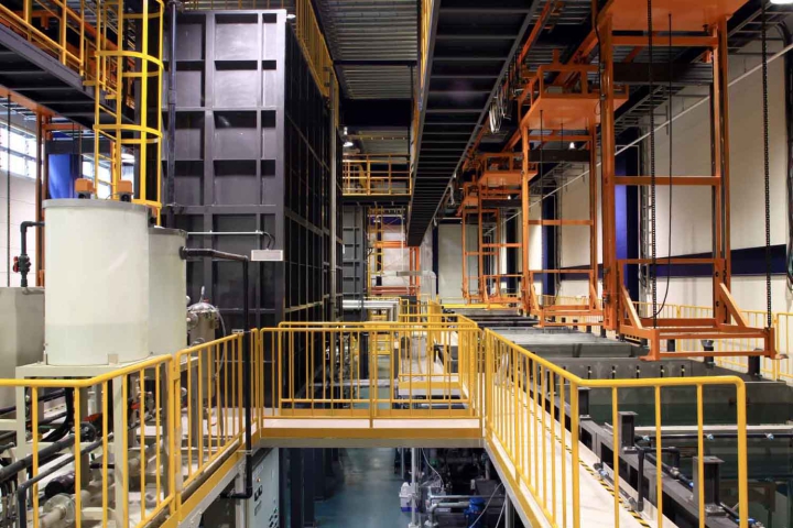
工場棟では、製造部品により機械レイアウトをフレキシブルに変更対応出来るよう、鉄骨純ラーメン構造を採用しブレースを無くしている。また、単調になりがちな工場空間の構成要素を色分けすることにより視覚的に変化を与えている。
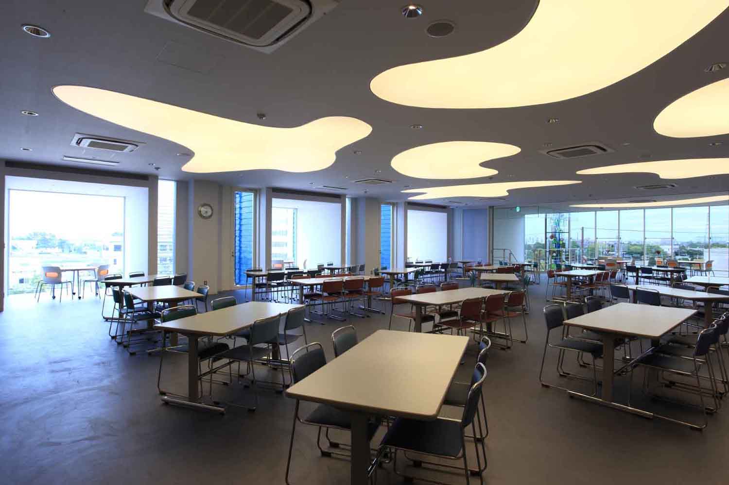
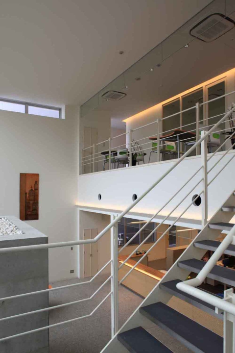
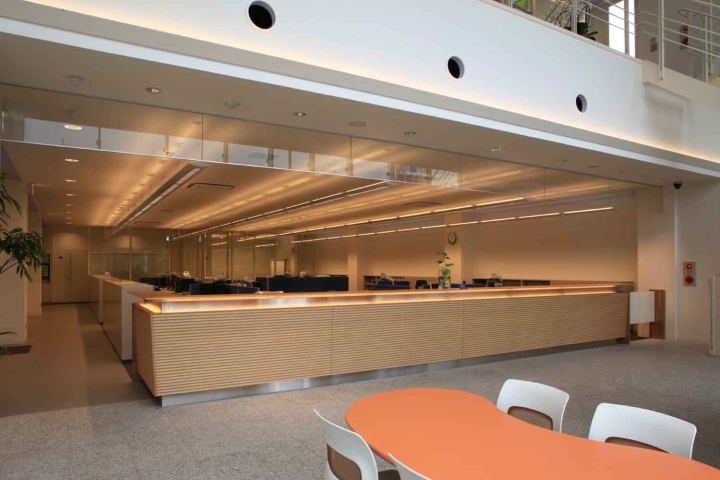
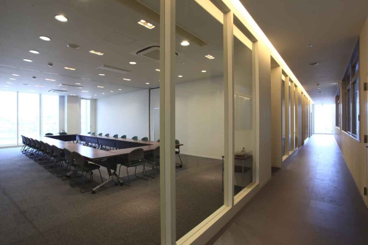
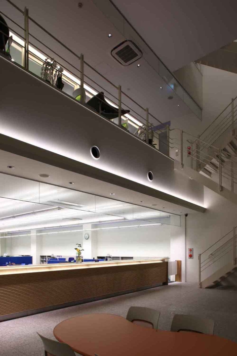
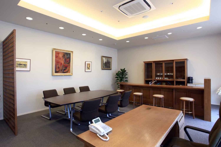
事務所棟では、全従業員が集まることが可能な3階スペースをデザインの核とし、メインは食堂だがそれ以外にもマルチな活用、展開ができるよう仕掛けている。また天井にはKBK・LOVEの文字をデフォルメした照明装置を設けることにより、空間に変化を与えると共に、従業員に愛社精神を培ってもらえるよう意図している。
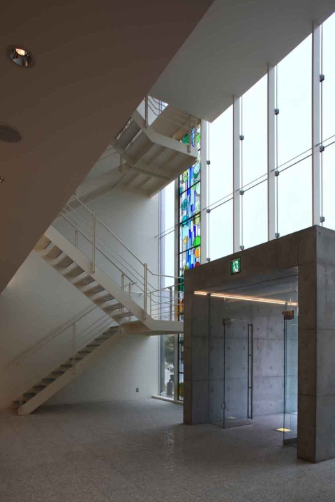
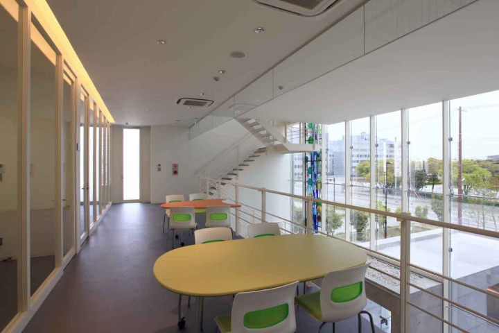
施主支給のステンドグラスは、クライアントと懇意のステンドグラス作家が、聖書の一文をモチーフにデザインされたもので、水玉の円の数が、従業員の人数分配置されており、クライアントの社員に対する思い入れの深さが表現されている。
This client purchased approximately 1 hectare of land within the Takasago Industrial Park with the aim of consolidating its cramped office and scattered factories.
The plan's first requirement was a building design that would improve the company's image, clarify (visualize) the complex intersecting production lines, and create a space that would motivate employees.
The overall exterior design represents the company's management philosophy as seven large walls, and the factory's main façade features a bent stainless steel panel with a deformed logo punched into it, creating a design that appeals to the company.
The factory building uses a pure steel frame structure and does not require braces, so that the machine layout can be flexibly changed depending on the manufactured parts.By color-coding the factory space, which tends to be monotonous, it gives visual variety.
In the office building, the third floor space where all employees can gather is at the core of the design. Although the main feature is the cafeteria, it is also designed to be used for a variety of other purposes.
Additionally, a lighting fixture with deformed letters for KBK.LOVE was installed on the ceiling, adding variety to the space while also aiming to foster a sense of company loyalty among employees.
The stained glass provided by the client was designed by a stained glass artist who is close to the client, and was based on a passage from the Bible. The number of polka dot circles corresponds to the number of employees, expressing the deep affection the client has for their employees.
全体の外観デザインでは、企業の経営理念を7枚の大壁に見立て、工場のメインファサードには、折り曲げ加工したステンレスパネルにデフォルメしたロゴをパンチングで加工したものを設置し、自社をアピールしたデザインとしている。
工場棟では、製造部品により機械レイアウトをフレキシブルに変更対応出来るよう、鉄骨純ラーメン構造を採用しブレースを無くしている。また、単調になりがちな工場空間の構成要素を色分けすることにより視覚的に変化を与えている。
事務所棟では、全従業員が集まることが可能な3階スペースをデザインの核とし、メインは食堂だがそれ以外にもマルチな活用、展開ができるよう仕掛けている。また天井にはKBK・LOVEの文字をデフォルメした照明装置を設けることにより、空間に変化を与えると共に、従業員に愛社精神を培ってもらえるよう意図している。
施主支給のステンドグラスは、クライアントと懇意のステンドグラス作家が、聖書の一文をモチーフにデザインされたもので、水玉の円の数が、従業員の人数分配置されており、クライアントの社員に対する思い入れの深さが表現されている。
This client purchased approximately 1 hectare of land within the Takasago Industrial Park with the aim of consolidating its cramped office and scattered factories.
The plan's first requirement was a building design that would improve the company's image, clarify (visualize) the complex intersecting production lines, and create a space that would motivate employees.
The overall exterior design represents the company's management philosophy as seven large walls, and the factory's main façade features a bent stainless steel panel with a deformed logo punched into it, creating a design that appeals to the company.
The factory building uses a pure steel frame structure and does not require braces, so that the machine layout can be flexibly changed depending on the manufactured parts.By color-coding the factory space, which tends to be monotonous, it gives visual variety.
In the office building, the third floor space where all employees can gather is at the core of the design. Although the main feature is the cafeteria, it is also designed to be used for a variety of other purposes.
Additionally, a lighting fixture with deformed letters for KBK.LOVE was installed on the ceiling, adding variety to the space while also aiming to foster a sense of company loyalty among employees.
The stained glass provided by the client was designed by a stained glass artist who is close to the client, and was based on a passage from the Bible. The number of polka dot circles corresponds to the number of employees, expressing the deep affection the client has for their employees.